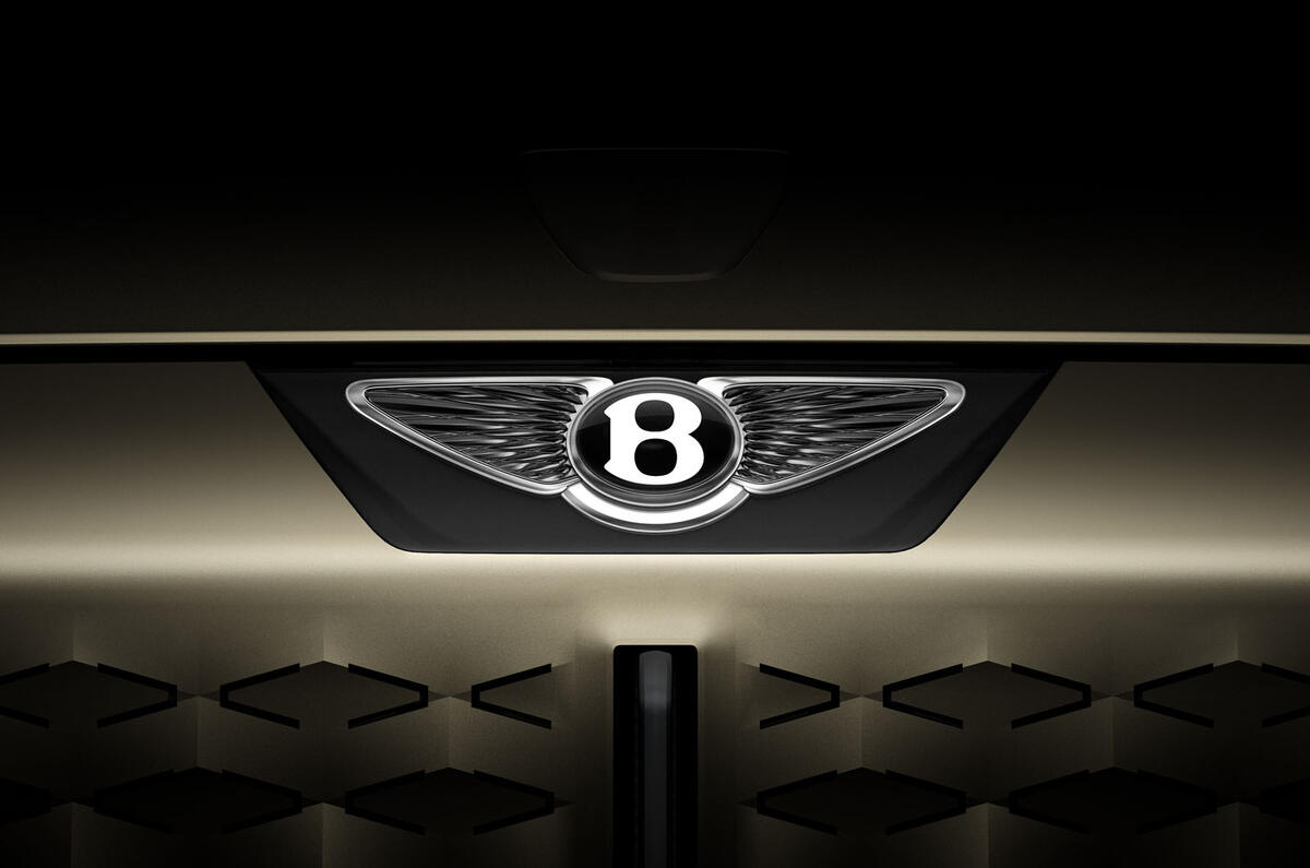
Bentley has revealed a new version of its trademark winged B emblem that will be worn by all of its future production cars - beginning with its debut EV, which will be uncovered next year.
Sharper and more minimalist than the logo it replaces, this new badge takes Bentley into the digital age with a cleaner treatment that better matches the design of its next-generation cars, taking inspiration from luxury watches and birds of prey.
Bentley says the new branding is "the first step of a design and brand revolution at the British marque" and "symbolic of an exciting future".
Before being affixed to any production cars, the reworked motif will appear first on a new era-defining concept car, to be revealed on Tuesday 8 July as a preview of a radical new design language for the brand's future cars, including the first electric Bentley - an 'urban SUV' that will sit underneath the Bentayga.
Bentley has yet to reveal official details of this new concept but has said it takes inspiration from "an iconic Bentley of the past" while setting the tone for its next-generation line-up.
The design of the new logo – and the concept car it will adorn – is a manifesto for Bentley’s director of design Robin Page, who was appointed in 2023 as the replacement for Andreas Mindt, who left Crewe to lead design at Volkswagen.
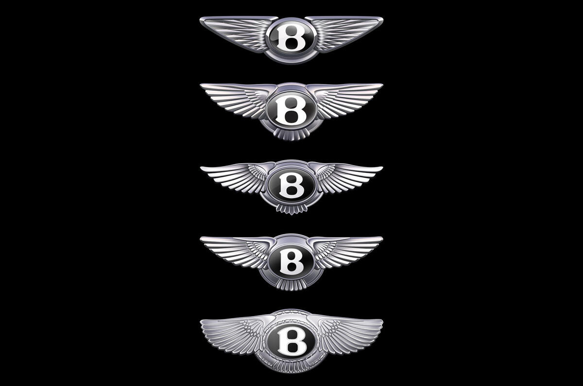
Page, who spent 17 years in Bentley’s design team before a stint leading Volvo's design team, told Autocar that the arrival of a new era-defining Bentley concept meant "this was a great time to do a new logo" - this being only the fifth iteration of the winged emblem in the firm's 106-year history.

The priority for Bentley’s new emblem was to introduce an edgier, sharper look more in keeping with the shapes and cues that Page will introduce to the cars themselves - so one of the most obvious changes is the removal of the lower set of feathers that used to sit below the B.
"They're quite soft,” Page told Autocar, “and what we've related it to, actually, is an owl, in its soft feathers on the bottom.
"I like to pick characters or animals to reference things, and what I looked at then was the peregrine falcon, which has a sharper, more edgy wing profile. We've taken away the tail feathers to give it that speed. It was about purifying and simplifying the wings.”
Page added that he took inspiration from luxury watches in refreshing the look of the central B element: “Instead of just a flat surface, it's got a glass piece and a three-dimensional 'jewel'.”


Join the debate
Add your comment
If it were a "new logo", it wouldn't look anything like the current one. Which it does.
In viewing the central "B" sideways, does anyone see an owl. So much for the falcon imagery, eh?